
Motivation for this
The background to this package linked to a project I undertook about a year ago.
The video relates to the project and the how R really sped up the process.
The exam question was to use a regression model to predict admissions and we had to evaluate, as a consequence, 60 different variations. In Excel, this would have been a nightmare. Again, R to the rescue. You can see the presentation below, if interested:
Getting off my arse and creating the documentation / package
Reflecting and cogitating on the NHS-R conference this year, I thought why not use the remainder of Wednesday evening to hop on to R Studio and start to make this as a package. I found the MIT PDF very helpful: http://web.mit.edu/insong/www/pdf/rpackage_instructions.pdf.
So that is just what I did.
What does this package do?
It simply analyses the results of a logistic regression model and creates an odds plot. This, I found, was an easier way for the strategic audience to engage with the outputs of the tool.
Reflecting on this – I thought this is a really useful little chart and so OddsPlotty was born.
Installing the package
The installation of the package can be achieved by loading up R Studio and then typing in the code below:
1 | devtools::install_github("https://github.com/StatsGary/OddsPlotty", dependencies = TRUE) |
Once this has been typed into the console or script editor R will automatically look for the package on Github. This subsequently returns and loads the package into the environment, and then you can load this in by using library(OddsPlotty).
Using the package
The vignette I have created on the RPubs website shows how to use the tool: https://rpubs.com/StatsGary/547542.
Outputs from the tool
As this is now a ggplot2 object – you can also use the plot with different themes. The below are three examples of different themes from the tool:
Classic view
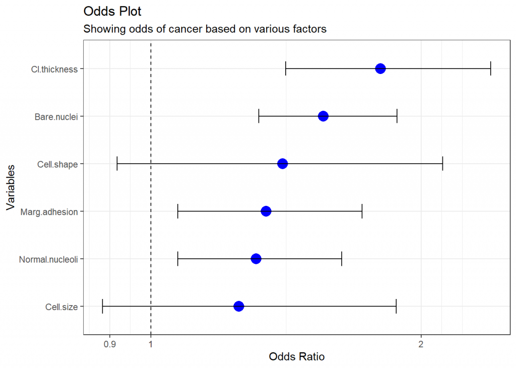
This shows, on the test dataset, that the odds of a cancer being benign or malignant, based on the sample I was using, are greater if the measured thickness and bare nuclei are larger. This is a sample machine learning dataset from the package mlbench.
Odds plot dressed in economist view
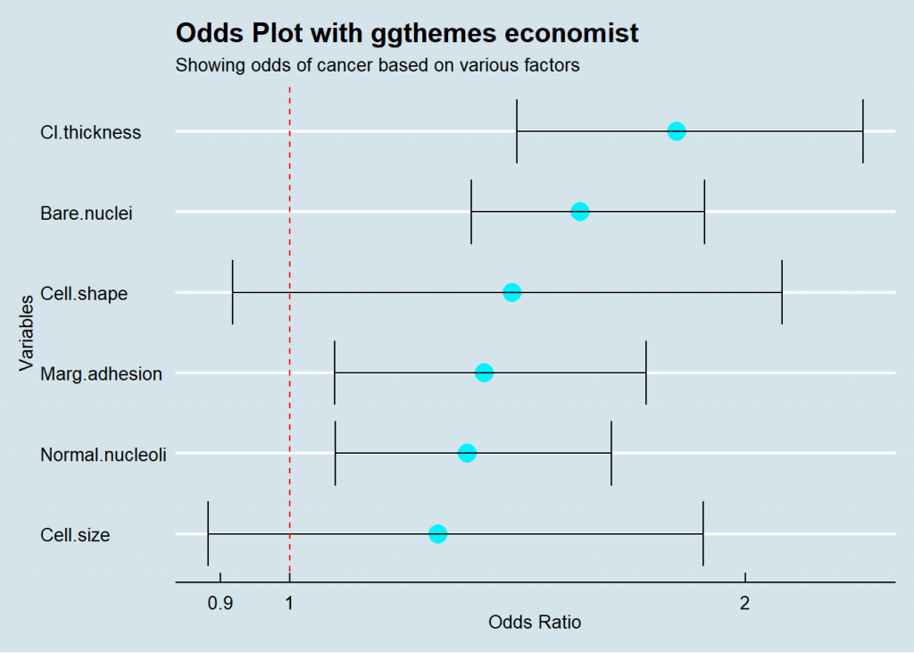
As you can see – the plot is flexible and allows for lots of customisability.
Edward Tufte would be proud
If you have never heard of Edward Tufte he was one of the pioneers of data visualisation. Read some of his stuff, the visuals are outdated, but the principles still hold true.
On a tangential, I will return to the final output used as an example:
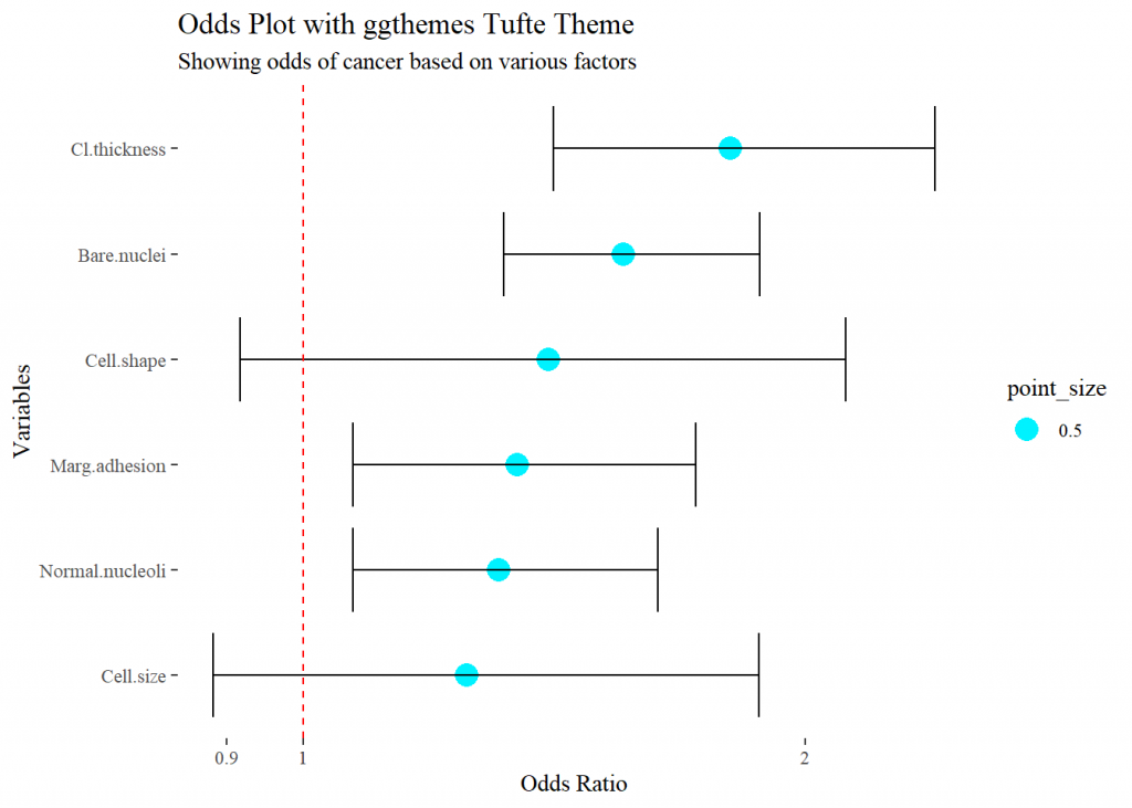
For the full implmentation of how to use this chart with logistic regression models – refer to the aforementioned vignette.
Evolution and iteration
This is just the first cut of the application, however, I would love to hear feedback and potential future developments for the tool. If you have found any issues or problems then leave a post on my Twitter page (using #oddsplottyR).
Please stay posted, as I aim to publish more packages in the future. The quote below resonates with me when it comes to some of the options in the devtools() package:
“It’s still magic even if you know how it’s done.”
― Terry Pratchett, A Hat Full of Sky
Any chance that it works with multinomial logistic regressions?