Diverging Bar Charts
The aim here is to create a diverging bar chart that shows variance above and below an average line. In this example I will use Z Scores to calculate the variance, in terms of standard deviations, as a diverging bar. This example will use the mtcars stock dataset, as most of the data I deal with day-to-day is patient sensitive.
Data preparation
The code below sets up the plotting libraries, attaches the data and sets a theme:
1 2 3 | library(ggplot2) theme_set(theme_classic()) data("mtcars") # load data |
Next, we will change some of the columns in the data frame and perform some calculations on the data frame:
1 | mtcars$CarBrand <- rownames(mtcars) # Create new column for car brands and names |
As commented, this line uses the existing mtcars data frame and uses the dollar sign notation i.e. add a new column, or refer to a column, to create a column name called CarBrand. Then we assign the car brand (<-) with the rownames from the data frame. This is obviously predicated on there being some row names in the data frame, otherwise you would have to name the rows using rownames().
Adding a Z Score calculation
A Z score is a calculation which uses the x observation subtracts said observation from the mean and divides by the standard deviation. The link shows the mathematics behind this, for anyone who is interested.
The following code shows how we would implement this score:
1 | mtcars$mpg_z_score <- round((mtcars$mpg - mean(mtcars$mpg))/sd(mtcars$mpg), digits=2) |
The statistics behind the calculation have already been explained, but I have also used the round() function to round the results down to 2 digits.
Creating a cut off (above/below mean)
The next step is to use conditional algebra (first advocated by one of my heroes George Boole) to check whether the Z score I have just created is greater or less than 0:
1 | mtcars$mpg_type <- ifelse(mtcars$mpg_z_score <- 0, "below", "above") |
The ifelse() block looks at whether the Z Score is below 0, if so tag as below average, otherwise show this as above.
The next two steps are to convert the Car Brand into a unique factor and to sort by the Z Score calculations:
1 2 | mtcars <- mtcars[order(mtcars$mpg_z_score), ] #Ascending sort on Z Score mtcars$CarBrand <- factor(mtcars$CarBrand, levels = mtcars$CarBrand) |
Now, I have everything I need to start to compute the plot. Great stuff, so let’s get plotting.
Creating the plot
First, I will start with creating the base plot:
1 | ggplot(mtcars, aes(x=CarBrand, y=mpg_z_score, label=mpg_z_score)) |
Here, I pass in the mtcars data frame and set the aesthetics layer (aes) of the x axis to the brand of car (CarBrand). The y axis is the Z score I created for miles per gallon (mpg) and the label is also set to the z score.
Next, I will add on the geom_bar geometry:
1 2 | ggplot(mtcars, aes(x=CarBrand, y=mpg_z_score, label=mpg_z_score)) + geom_bar(stat='identity', aes(fill=mpg_type), width=.5) + |
This indicates that I need to use the mpg_z_score field by forcing the stat=’identity’ option. If this was not added, then it would simply count the number of times the Car Brand appears as a frequency count (not what I want!). Then, I stipulate the fill type of the bar to be equal to whether the value deviates above and below 0 – remember we created a field in the data preparation stage to store whether this deviates below and above 0 and called it mpg_type. The last parameter is the width parameter to indicate the width of the bars.
Next:
1 2 3 4 5 | ggplot(mtcars, aes(x=CarBrand, y=mpg_z_score, label=mpg_z_score)) + geom_bar(stat='identity', aes(fill=mpg_type), width=.5) + scale_fill_manual(name="Mileage (deviation)", labels = c("Above Average", "Below Average"), values = c("above"="#00ba38", "below"="#0b8fd3")) + |
I use the scale_fill_manual() ggplot option to add the name to the legend, specify the label names using the combine function and stipulate that the values that are above average need to be hex coded by the value and the below values to a different code. I have weirdly chosen blue and green as an alternative to red, as I know we have accessibility there. We are nearly there, the final step is:
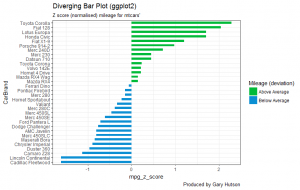
1 2 3 4 5 6 7 8 9 | ggplot(mtcars, aes(x=CarBrand, y=mpg_z_score, label=mpg_z_score)) + geom_bar(stat='identity', aes(fill=mpg_type), width=.5) + scale_fill_manual(name="Mileage (deviation)", labels = c("Above Average", "Below Average"), values = c("above"="#00ba38", "below"="#0b8fd3")) + labs(subtitle="Z score (normalised) mileage for mtcars'", title= "Diverging Bar Plot (ggplot2)", caption="Produced by Gary Hutson") + coord_flip() |
Here, I have added the labs layer on to the plot. This is a way to label your plots to show more meaningful values than would be included by default. So, within labs I use subtitle, title and caption to add labels to the chart. Finally, the important command is to add the coord_flip() command to the chart – without this you would have vertical bars instead of horizontal. I think this type of chart looks better horizontal, thus the reason for the inclusion of the command.
The final chart, looks as illustrated hereunder: