Creating the Dot Plot Variance chart
The data preparation was used in the previous blog entitled: Diverging Bar Charts – Plotting Variance with ggplot2.
Refer to that if you need to know how to create the data prior to this tutorial.
Setting up the Dot Plot Variance chart
1 2 3 4 5 6 7 8 9 10 11 | library(ggplot2) ggplot(mtcars, aes(x=CarBrand, y=mpg_z_score, label=mpg_z_score)) + geom_point(stat='identity', aes(col=mpg_type), size=6) + scale_color_manual(name="Mileage (deviation)", labels = c("Above Average", "Below Average"), values = c("above"="#00ba38", "below"="#0b8fd3")) + geom_text(color="white", size=2) + labs(title="Diverging Dot Plot (ggplot2)", subtitle="Z score showing Normalised mileage", caption="Produced by Gary Hutson") + ylim(-2.5, 2.5) + coord_flip() |
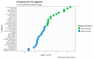
This is very similar to the previous plot we created in the previous post, however there are a few differences. The main difference is that we use a geom_point() geometry and set the colour of the points based on whether the said point deviates above and below the average. In addition, we use the geom_text() to set the colour of the text in the points to white and specify the size of the text. The final difference is that I have added a Y limit (ylim) range of -2.5 standard deviation to positive 2.5 standard deviations.
Running this block of code, along with the data preparation code, will give you a chart that looks as below:

Creating the Diverging Lollipop Chart
The code below shows how to build the diverging lollipop chart in R and ggplot2:
1 2 3 4 5 6 7 8 9 10 11 12 13 14 15 16 | ggplot(mtcars, aes(x=CarBrand, y=mpg_z_score, label=mpg_z_score)) + geom_point(stat='identity', aes(col=mpg_type), size=6) + scale_color_manual(name="Mileage (deviation)", labels = c("Above Average", "Below Average"), values = c("above"="#00ba38", "below"="#0b8fd3")) + geom_segment(aes(y = 0, x = CarBrand, yend = mpg_z_score, xend = CarBrand), color = "black") + geom_text(color="white", size=2) + labs(title="Diverging Lollipop Chart", subtitle="Z score for normalised mileage", caption="Produced by Gary Hutson") + ylim(-2.5, 2.5) + coord_flip() + theme(panel.grid.major = element_blank(), panel.grid.minor = element_blank()) |
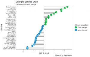
Similar geometries are used here. What has been added here is the <b>geom_segment()</b> this shows how the line segments need to be added. The starting y is equal to 0 on the Y scale and the starting x is the first car by the car brand. Similarly, the end of the x (xend) is also the CarBrand.
The only other difference is to add a theme constraint to the end of the code to turn off the major and minor grid lines, this is achieved by setting the panel.grid.major and panel.grid.minor equal to element_blank().
The completed graph and plot is shown below:

There – we now have some lovely looking charts that can be put into a report to report on variance between categorical variables.
