
I was inspired by my friend John Mackintosh to have a muck around with the fabulous gganimate. I have to say…. I am in love. I can remember coding this into Excel VBA, to get my animations to work on my data, and now R has the potential.
John will remind me that it has been available for a while, but it is new to me.
Setting up the random data
I started by creating a purely randomised dataset to store my new and follow appointments and from here I calculated a new and follow up ratio. The code for the data setup is included below:
install_or_load_pack <- function(pack){ create.pkg <- pack[!(pack %in% installed.packages()[, "Package"])] if (length(create.pkg)) install.packages(create.pkg, dependencies = TRUE) sapply(pack, require, character.only = TRUE) } packages <- c("ggplot2", "tidyverse", "gganimate", "dplyr", "gifski", "png", "lubridate") install_or_load_pack(packages) #Animation of new and follow up ratios over months theme_set(theme_minimal()) set.seed(123) new <- ifelse(rnorm(10000) <=0, 1, rnorm(10000)^2) fup <- ifelse(rnorm(10000) <=0, 1, rnorm(10000)^2) ratio <- fup/new date_seq1 <- c(seq(as.Date("2015/1/1"), by = "day", length.out = 2500), seq(as.Date("2015/1/1"), by = "day", length.out = 2500), seq(as.Date("2015/1/1"), by = "day", length.out = 2500), seq(as.Date("2015/1/1"), by = "day", length.out = 2500)) area <- c(rep("Cancer",2500), rep("Medicine",2500),rep("Surgery",2500), rep("Family Health",2500)) op_df <- tibble(date=date_seq1, new=round(new, digits = 2)*2, fup=round(fup, digits = 2)*5, fup_new_ratio=round(ratio, digits=2), division=area, year=round(year(date_seq1), digits = 0), month=round(month(date_seq1),digits = 0)) str(op_df) #Uses random sampling to arrive at 500 random observations and then I raise them to the #power of 2 to arrive at something that looks more like new and follow up numbers in #outpatient clinics |
To explain the above I have, in essence, loaded in the required packages, these are specified in the packages vector. Then, I use the custom function in one of my previous blogs to create the function to install or load the required packages.
The data is then constructed by creating variables and using a random normal distribution with 10000 elements. I then create spurious data sequences and make these 2500 long each, as I have four divisions that I want to split the data down by. The divisions are created by the area vector and I use the rep function here to replicate the division names.
After all that I create a tibble (data frame) with the below structure:
str(op_df) Classes ‘tbl_df’, ‘tbl’ and 'data.frame': 10000 obs. of 7 variables: $ date : Date, format: "2015-01-01" "2015-01-02" ... $ new : num 2 2 2 0 2.92 0.18 0.18 2.22 3.84 7.24 ... $ fup : num 18 5 0.3 5 0.3 0.7 5 0.35 1.7 0.8 ... $ fup_new_ratio: num 3.6 1 0.06 736.18 0.04 ... $ division : chr "Cancer" "Cancer" "Cancer" "Cancer" ... $ year : num 2015 2015 2015 2015 2015 ... $ month : num 1 1 1 1 1 1 1 1 1 1 ... |
Creating the base ggplot
Following on from getting my data prepared – I then create a plot that has the new volumes on the x axis and the follow up volumes on the y axis. I set the size of the markers to the size of the follow up to new ratio and set the colour equal to the specific division.
Then, I add labels to the chart:
plot <- ggplot(data=op_df, aes(x=op_df$new, y=op_df$fup, size=op_df$fup_new_ratio, color=factor(op_df$division))) + geom_point(show.legend = F, alpha= 0.7) #Save the plot in a temp variable plot <- plot + scale_fill_viridis_d() + scale_size(range=c(3,12)) + labs(title= "New and Follow up ratio", x="New appointments", y="FUP appointments", caption = "Produced by Gary Hutson") |
The next step is easy, as I have been saving the plots along the way. Now, I just need to reference my plot and add a few additional commands.
Jazzing it up with gganimate
Now, all I need to do is make sure I have the gganimate library loaded and then I am going to set one of gganimates functions transition_time() to transition by the year:
plot <- plot + transition_time(op_df$year) + labs(title="Year: {frame_time}", x="FUP", y="New") image <- animate(plot) image #Save to gif anim_save("op_by_year_scatter.gif", image) #This saves to your working directory |
This then creates my scatter chart transitioning by each year:
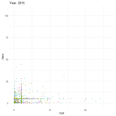
Obviously, we would not expect the pattern to pulsate quite like that with real data, but this is there to serve as an example.
Faceting by dimension
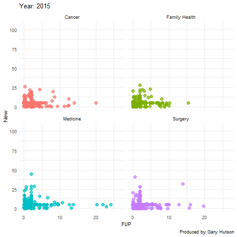
Not much needs to be adapted to facet by dimension, or in this case medical division. I use the facet_wrap() command to do this:
plot + facet_wrap(~op_df$division) + transition_time(op_df$year) + labs(title="Year: {frame_time}", x="FUP", y="New") image <- animate(plot) image anim_save("op_by_year_by_division.gif", image) |
This creates a facet grid by the four divisions in the data to show how each one of them moves separately:
The gganimate commands are really flexible and there is much more you can do with this package. Thanks to the guru Thomas Lin Pedersen!
For the code for this tutorial you can find this on my GITHUB account, the link is here.
I agree with Moss (credit The IT Crowd):